How to Use the Map & Timeline
Overview
On this map, we show population growth from the year 1 C.E. to the present and project our growth into the year 2050. Population concentrations are indicated by yellow (●) and red (●) dots – each of which represent one million people. In areas where people are spread out and do not live in concentrations of one million, dots are placed in the middle of their approximate range. Yellow dots with red centers can be clicked to see pop-up notes to provide greater context about the country and its local population.

Milestones events that detail key moments throughout history are also displayed on the map as white triangles (▴), just as they are on the timeline. These milestones are organized by theme: Food & Agriculture, Health, People & Society, Environment, and Science & Technology.
Additionally, other key data is visualized as map overlays including: Fossil Fuel CO2 Emissions, Fertility Rates, Urbanization, and Life Expectancy.
Map Controls
A wide set of options are available to help you explore the map and data.
In the top left, three menus allow you to control the types of data displayed on the map.
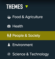
Themes
All themes are selected as a default. If you want to focus on a particular theme or themes, deselect the other themes from the menu dropdown. Only milestone events from selected themes will be displayed.
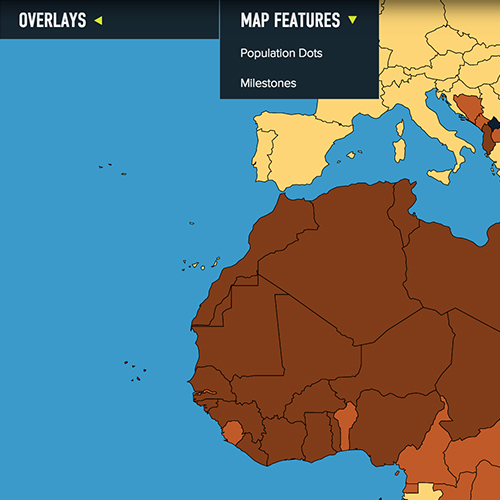
Overlays
Choose a data set to see it visualized on the map. Each data set covers a specific range of years. To find the range for a data set simply look to the right of its title on the overlay drop down menu. If you are currently viewing a year the falls outside the date range, you will automatically jump to the first year that data is available upon selecting the overlay.
Only one overlay can be selected at a time. A corresponding key to the right of the map provides the interpretation of the data.

Map Features
Toggle the Population Dots and Milestones on and off. This feature removes all dots and triangles from the map for focus on the individual overlay data sets.
Along the left edge of the site are controls that allow you to adjust the map view. You can view the Earth as a flat map () — referred to as a mercator projection — or a globe ().
There are five levels of zoom, controlled by the two magnifying glasses ( zoom in, zoom out). Once you have reached the maximum level of zoom in either direction the magnifying glass will no longer be highlighted.
You can all easily reposition the map or globe by clicking and dragging the map.
Also included in the set of controls on the left is a link () to the World Population Video, viewable in multiple languages.
Timeline
Like the map, the timeline also has features that will help you explore the data.
The zoom icons, controlled by two magnifying glasses (, ), on the bottom left allow you to adjust the range of time displayed on the timeline. The timeline can be viewed in increments of 100, 50, 10 or 5 years. Once zoomed-in, you can drag the entire timeline left and right to explore future or past dates that are not shown in the display. Each one of the white triangles indicates a milestone event. Click on the triangle to display a pop-up box to explore its significance.
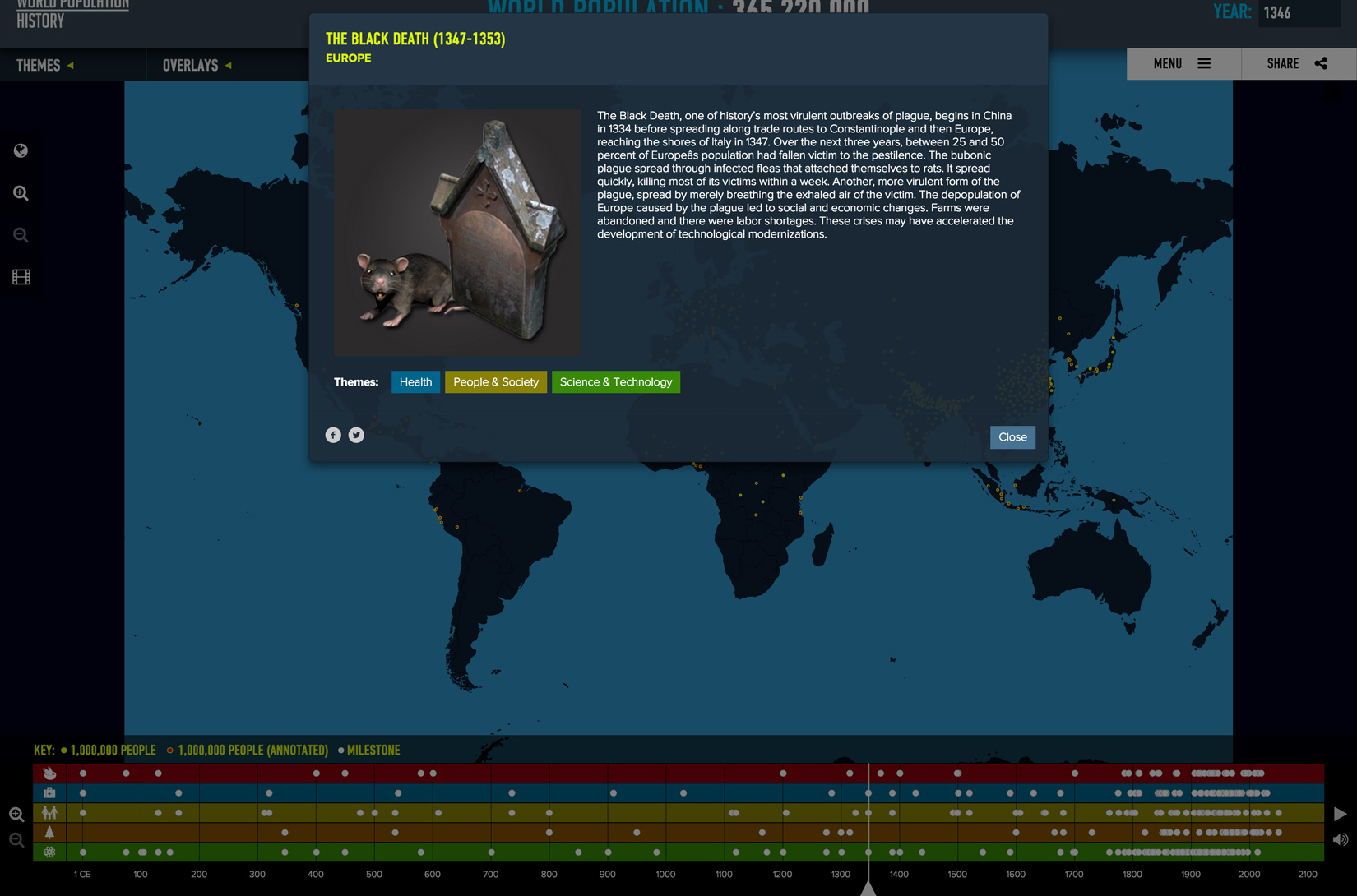
All milestone events are categorized into five major themes, with many events spanning multiple themes. Almost all milestone events have a location on the map above. You can also click on any white triangle displayed on the map to show the same information.
To jump to a specific year, simply drag the timeline bar or click on a specific date. You can also enter a specific year in the YEAR box in the top right corner of the site, as well as click the arrows to adjust the year. The timeline bar will position itself to correspond to whatever year is displayed in the YEAR box.
You can also choose to auto-play the experience by selecting the data you’d like to view from the menus in the top left and then clicking the play icon () to the right of the timeline.